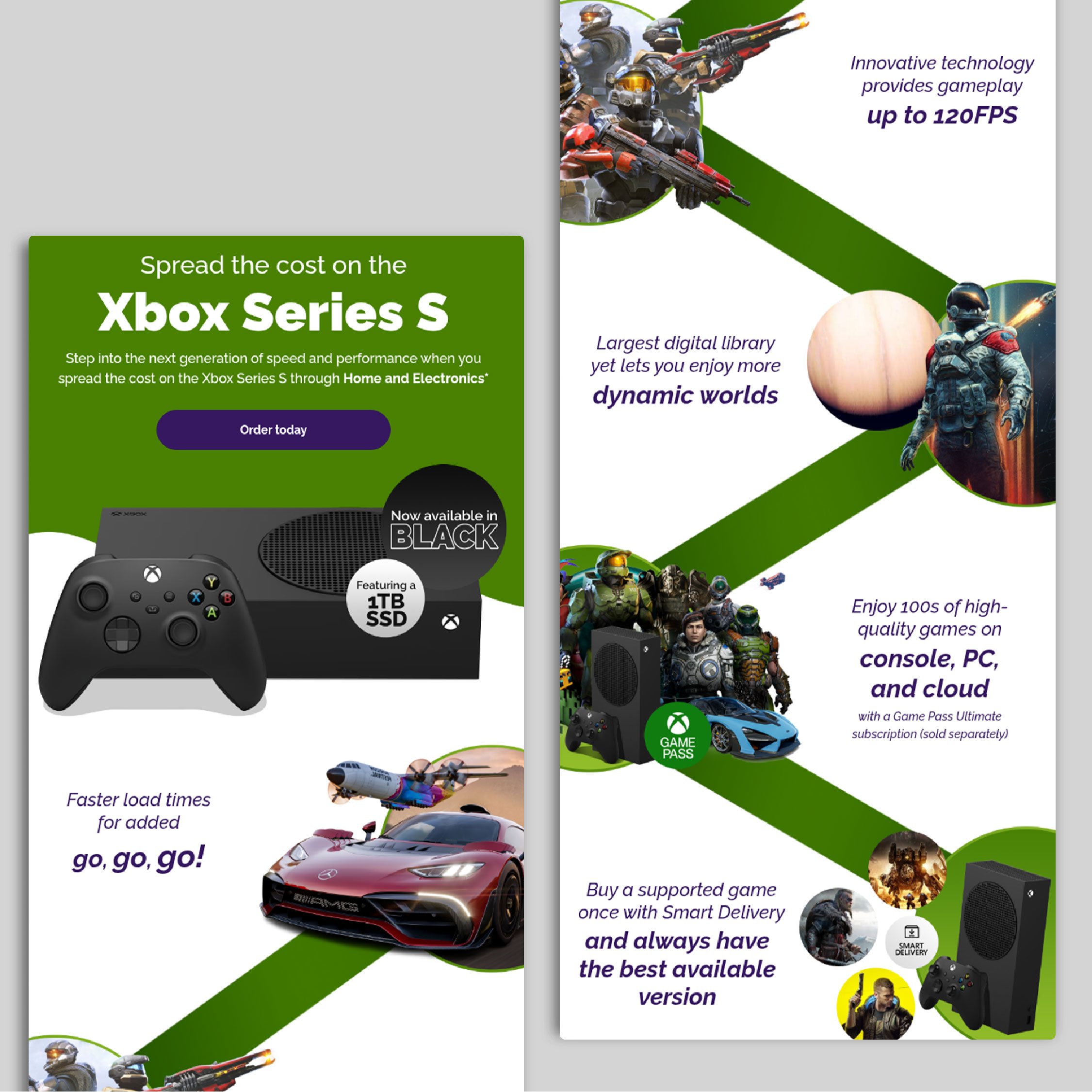
Xbox Series S targeted email
The Approach
When approaching this design, I focused on creating an engaging email layout that immediately captures attention while remaining clear and easy to navigate. The bold colour palette helps reflect the energetic aesthetic associated with Xbox gaming, while the large hero section featuring the console establishes the theme and draws the viewer in from the outset.
I structured the layout with a clear visual hierarchy, using strong typography and a prominent call-to-action to guide users toward exploring the gaming category. The product has a zig zag approach which allows for spotlights into what the console can do and is arranged in a clean layout allowing users to browse quickly while keeping the design visually balanced and easy to follow.
Overall, the aim was to create a dynamic yet organised design that encourages engagement while maintaining a professional and accessible layout that sticks to the core values of the company and Xbox branding.

The Challenges & Results
The challenge was balancing company branding with the instantly recognisable Xbox identity. By combining the signature pop of green with branded accents of purple, the design ensured the product stood out while remaining cohesive.
The final layout followed a dynamic left-to-right flow, creating a fun, guided journey through the email.
Spotlight of my work
Welcome to the spotlight, where I highlight some of my favorite projects for
your eyes to see and enjoy