Nintendo Switch 2 Email Animation
The Approach
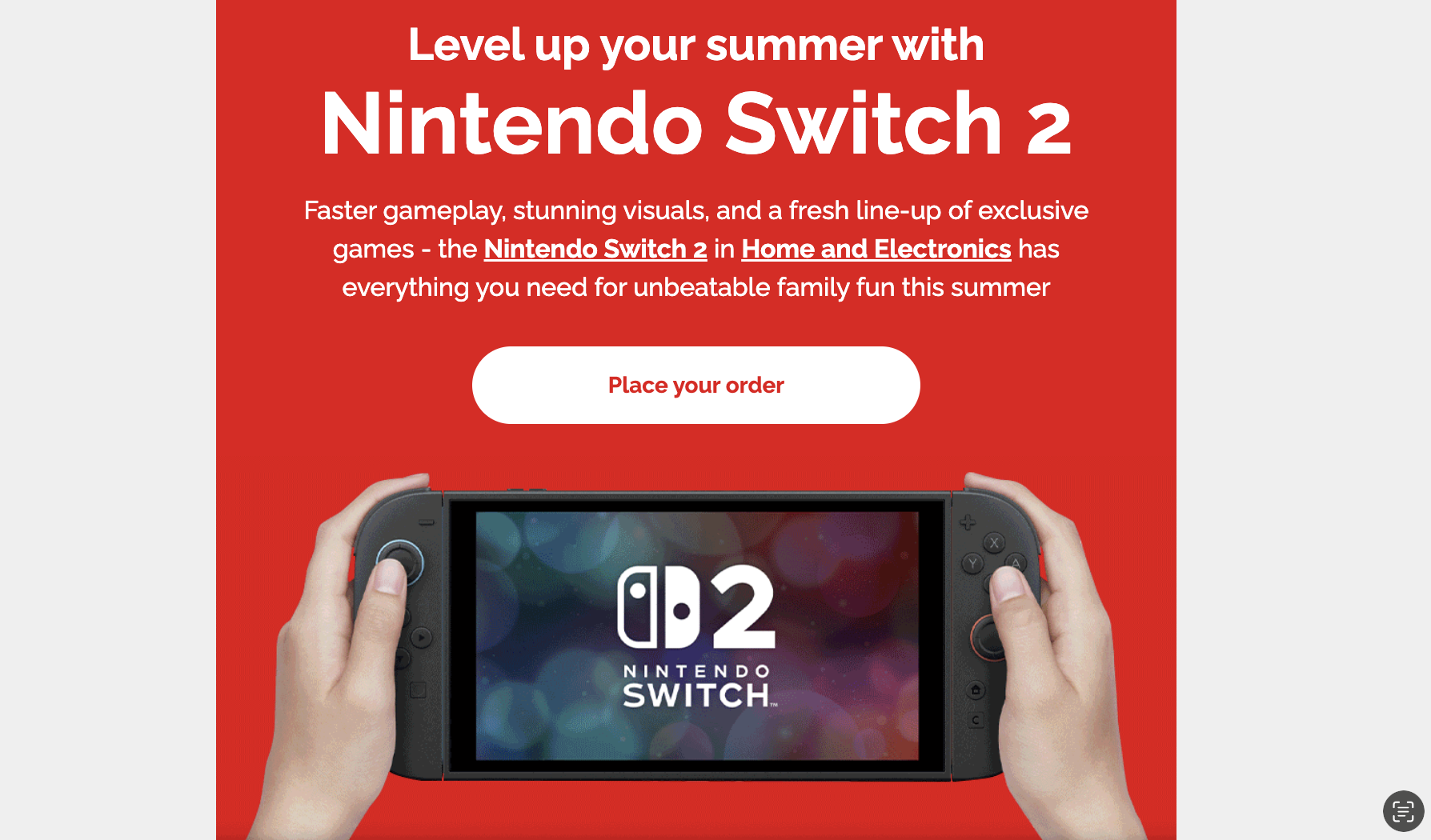
When approaching this design, I focused on creating a bold and high-impact layout that immediately captures attention and reflects the energetic identity of the Nintendo Switch 2. The strong red background establishes instant brand recognition while providing a clean canvas for the content to stand out.
I used a clear typographic hierarchy, with the headline drawing focus first, followed by supporting copy and a prominent call-to-action to guide the user journey. The central product image anchors the design, using a realistic in-hand visual to create a sense of interaction and excitement, while also showcasing gameplay to reinforce the product experience.
To help engagment creating a video version of this design would significantly enhance its impact by adding movement and storytelling to an already strong visual concept. By animating elements such as product, you can guide the viewer’s attention more dynamically and create a more engaging user experience.
The Challenges & Results
One of the main challenges in this design was balancing a bold, high-impact visual style with clear and accessible communication. The strong red background, while effective for brand recognition, required careful consideration to ensure text remained legible and hierarchy was not lost. Another challenge was presenting a large amount of promotional information without overwhelming the user, while still keeping the layout clean and easy to navigate.
Additionally, ensuring the product remained the focal point while incorporating supporting messaging and a clear call-to-action required thoughtful composition and spacing. The final design successfully delivers a visually striking and engaging layout that captures attention immediately while maintaining clarity and structure.
Spotlight of my work
Welcome to the spotlight, where I highlight some of my favorite projects for
your eyes to see and enjoy