Nintendo Switch OLED targeted email
The Approach
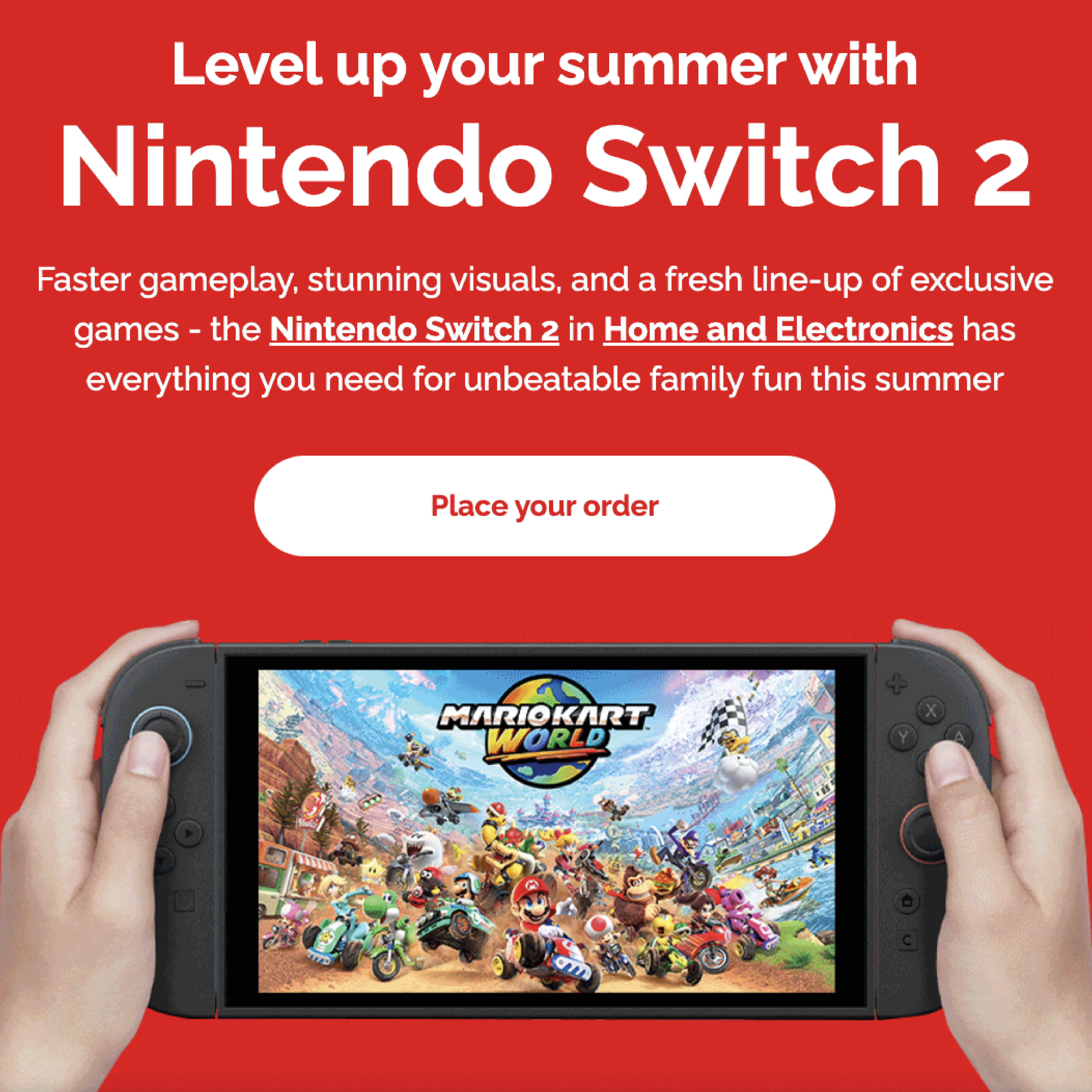
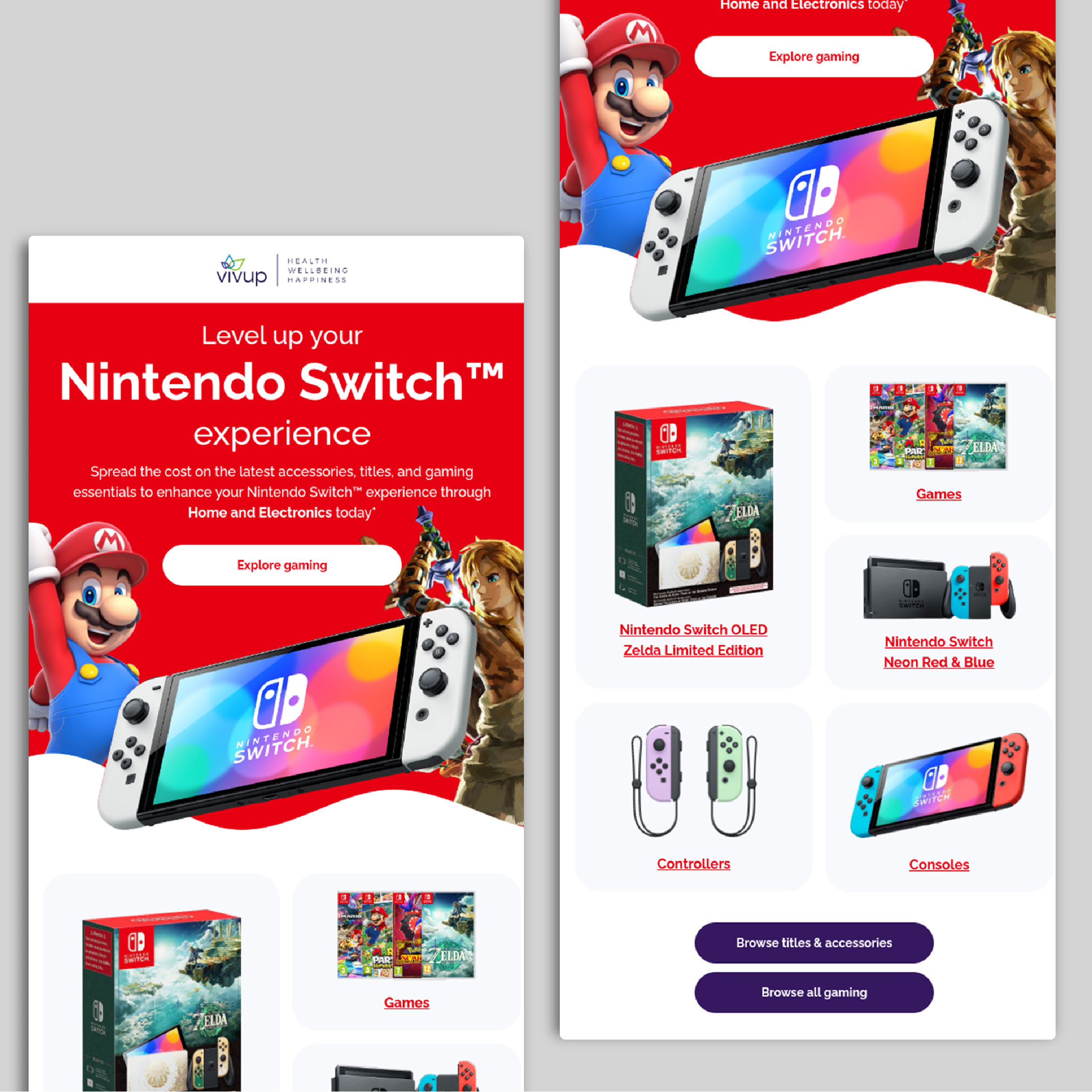
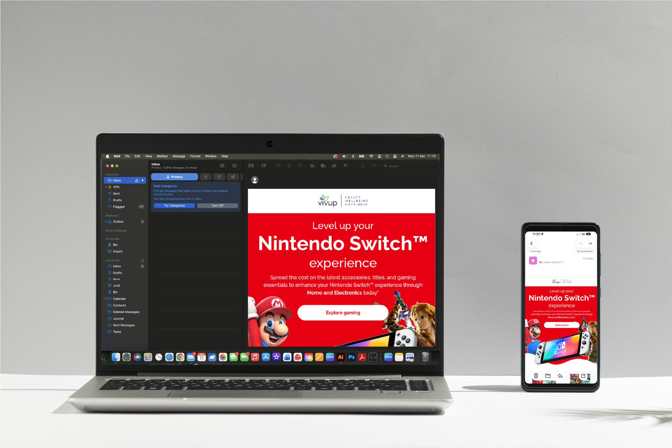
When approaching this design, I focused on creating an engaging email layout that immediately captures attention while remaining clear and easy to navigate. The bold red background helps reflect the recognisable gaming aesthetic associated with the Nintendo Switch, while the large hero section featuring the console and characters draws the viewer in and establishes the theme instantly.
I structured the layout with a clear visual hierarchy, using strong typography and a prominent call-to-action to guide users toward exploring the gaming category.
The product tiles below are arranged in a clean grid, allowing users to quickly browse consoles, games, and accessories while keeping the design visually balanced and easy to scan. Overall, the aim was to create a dynamic yet organised design that encourages engagement while maintaining a professional and accessible layout.
The Challenges & Result
The key challenge with the Nintendo Switch email was seamlessly incorporating Nintendo branding into our existing
layout. This led to a distinctive, attention-grabbing header design that immediately drew the viewer in and encouraged
them to scroll through the available products.
The final design feels engaging and clearly aligned with Nintendo’s recognisable brand identity. This email increased the sales of the Nintendo Switch OLED in which led to big percentage increase in our Home and Electronics section.
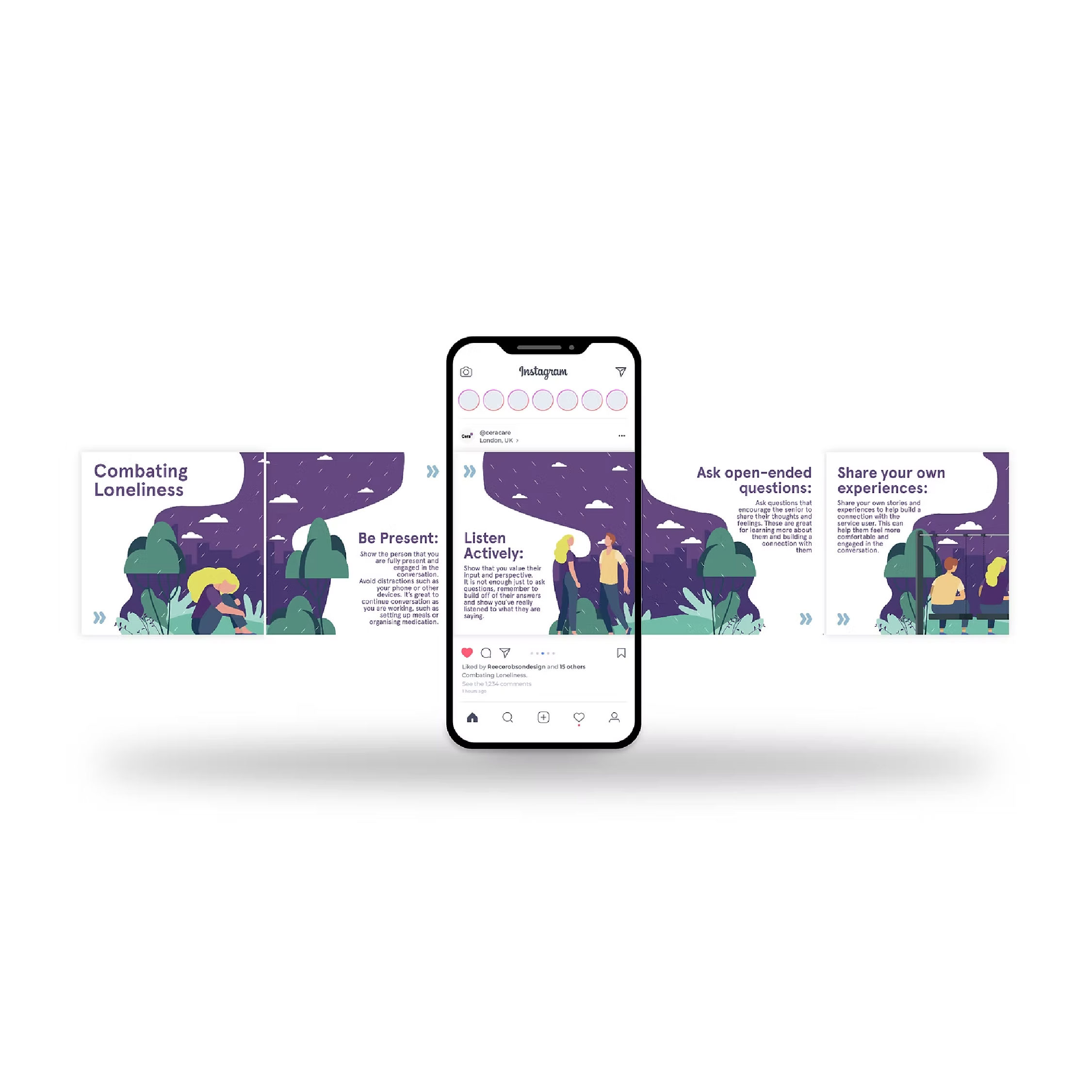
Spotlight of my work
Welcome to the spotlight, where I highlight some of my favorite projects for
your eyes to see and enjoy