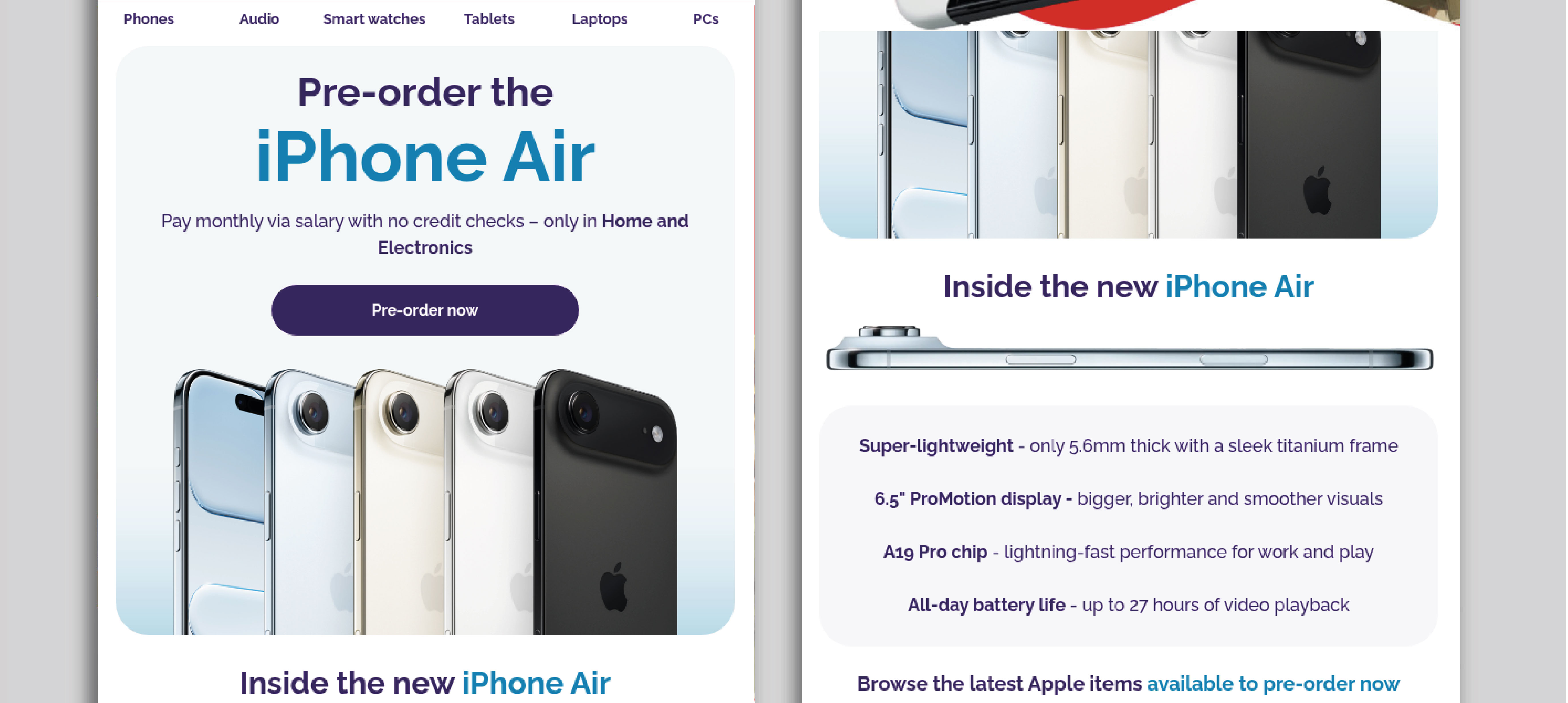
iPhone Air Launch Targeted Email
The Approach
When approaching this design, I focused on creating a clean, premium email layout that reflects the sleek and modern aesthetic associated with Apple products. I used a soft, neutral background paired with subtle gradients and a refined purple accent to create a sense of sophistication, while ensuring key elements such as calls-to-action remained clearly visible. The large hero section featuring the iPhone Air was designed to immediately capture attention and establish the product as the focal point, supported by minimal yet impactful typography.
I structured the layout with a clear visual hierarchy, using concise headings and well-spaced content blocks to guide the user naturally through the email. Product features are presented in a simple, scannable format, allowing users to quickly understand key benefits without feeling overwhelmed. The inclusion of supporting product tiles, such as Apple Watch and AirPods, helps to encourage cross-selling while maintaining a balanced and uncluttered layout.

The Challenges & Results
One of the key challenges in this brief was aligning the design with Apple’s recognisable visual language while still fitting within the existing brand framework. This required careful consideration of spacing, typography, and imagery to achieve a minimal yet engaging design without overcomplicating the layout.
The final outcome is a polished and user-friendly email that feels both premium and accessible. It successfully highlights the product’s key features, encourages interaction through clear calls-to-action, and creates a seamless browsing experience, ultimately supporting increased engagement and driving interest in pre-orders within the Home and Electronics category.
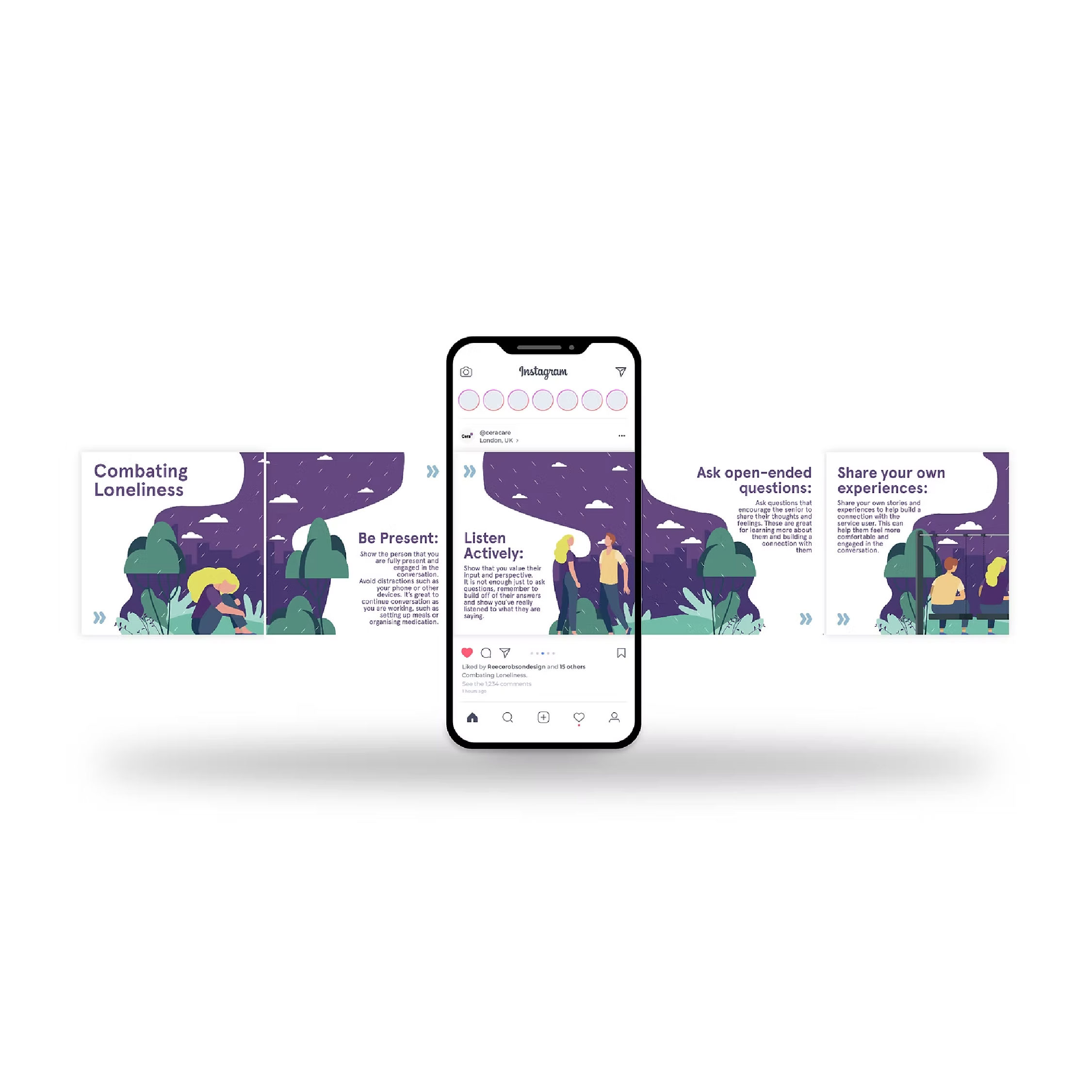
Spotlight of my work
Welcome to the spotlight, where I highlight some of my favorite projects for
your eyes to see and enjoy