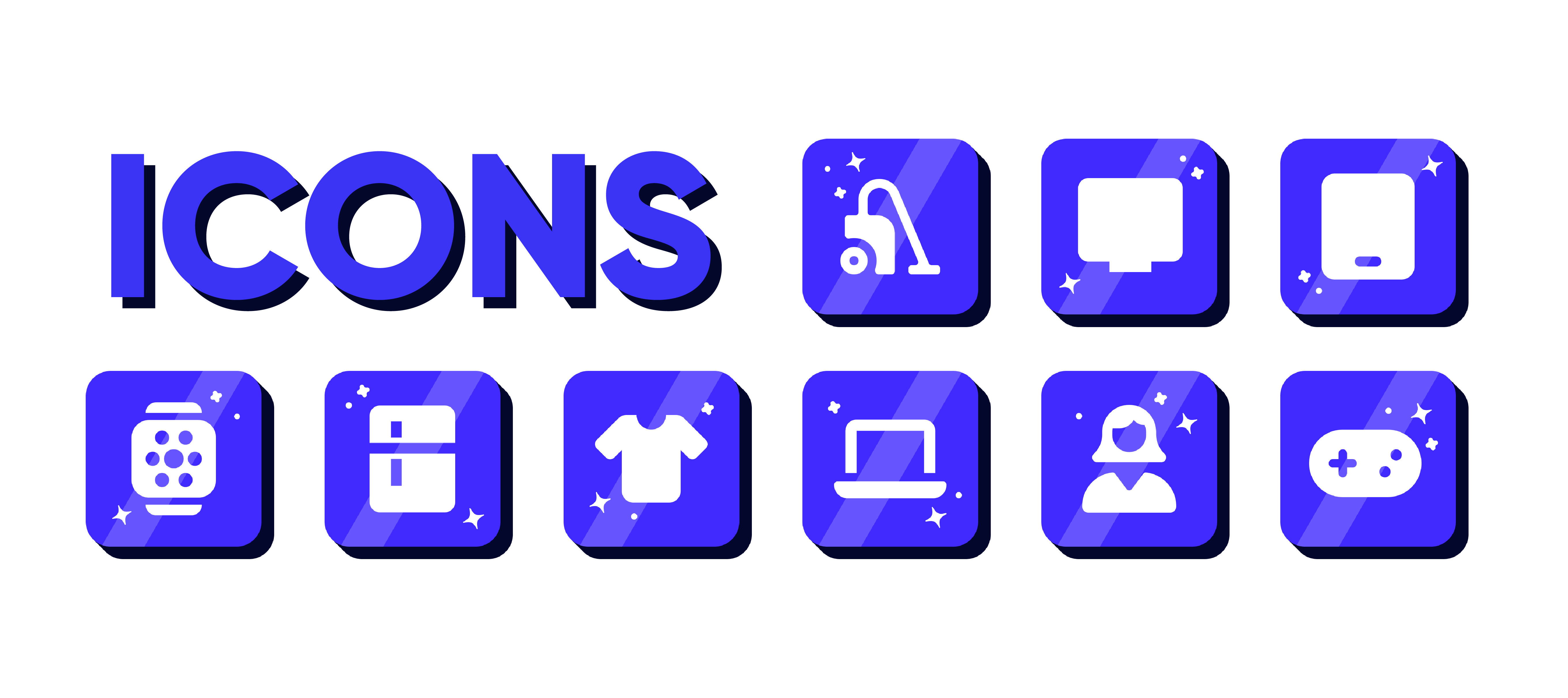
Home and Electronics Icon Set
The Approach
My approach to creating these icons was centred around developing a consistent and recognisable visual language that aligns with a modern, digital-first brand. I chose a bold purple gradient as the primary colour to convey creativity, innovation, and a sense of energy, while ensuring the white iconography remained highly legible and accessible across different screen sizes.
The use of soft rounded corners and subtle shadows was intentional to give the icons a friendly, approachable feel, avoiding a harsh or overly corporate tone. I also incorporated small decorative spark elements to add personality and visual interest, helping the icons feel more engaging without compromising clarity.
In terms of layout and style, I maintained a uniform structure across all icons to ensure consistency and ease of recognition, allowing users to quickly associate each symbol with its function. Overall, my design approach focused on balancing clarity and character, creating a cohesive icon set that enhances usability while reflecting a brand that values both professionalism and approachability.

The Challenges & Results
One of the main challenges I faced when designing these icons was maintaining consistency across the entire set while still ensuring each icon was clearly distinguishable. Because all icons follow the same visual style—rounded shapes, gradient backgrounds, and white pictograms—it required careful consideration of form and detail to make sure each symbol remained instantly recognisable without becoming repetitive.
Additionally, incorporating decorative elements like the spark details required restraint. While they help add personality and visual interest, overusing them could have made the icons feel cluttered or distracting, so I had to apply them subtly and consistently, this also aligns with the brand guidelines.
Overall, the key challenge was balancing creativity with usability, designing a set of icons that feels visually engaging and on-brand, while still being clear, functional, and easy for users to understand at a glance.
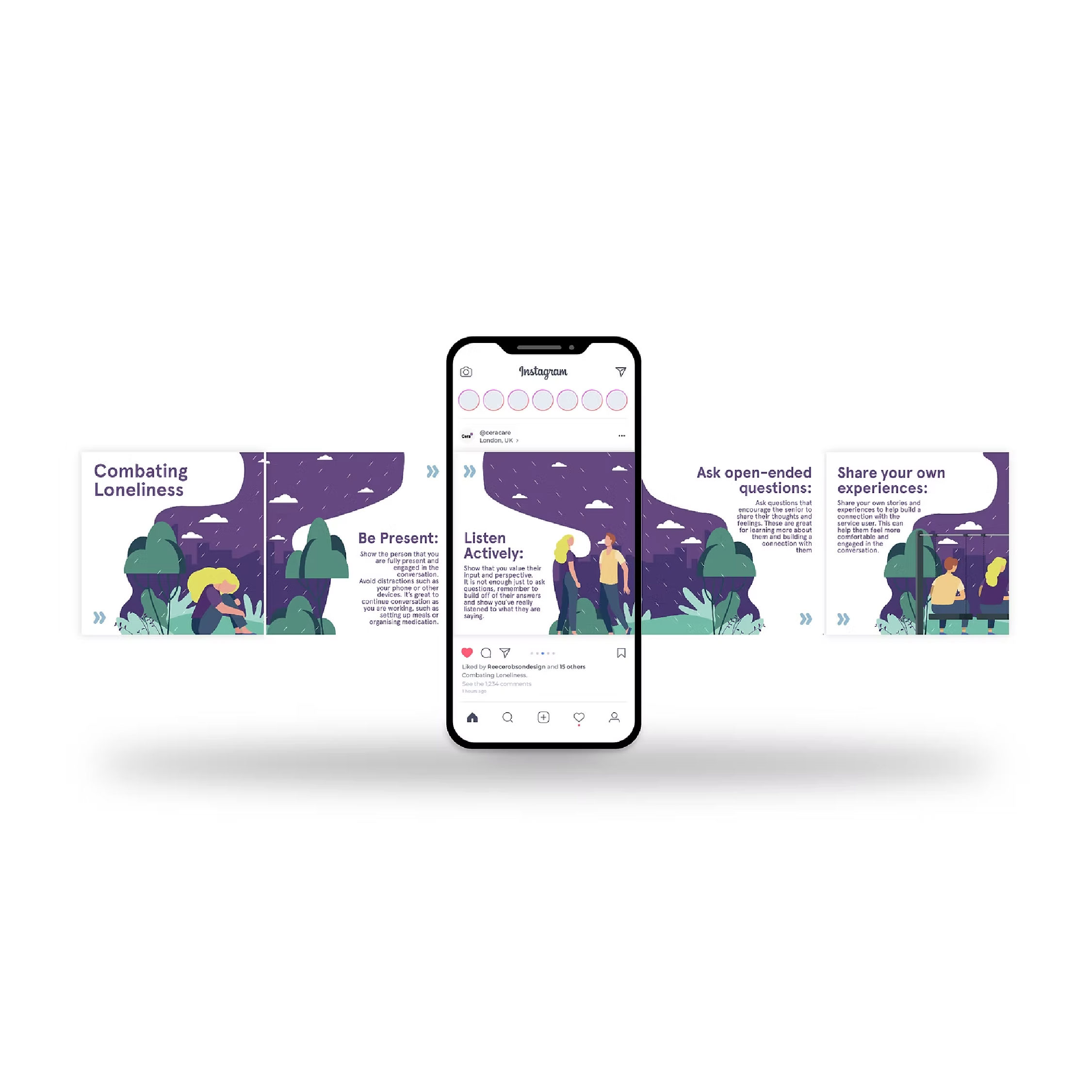
Spotlight of my work
Welcome to the spotlight, where I highlight some of my favorite projects for
your eyes to see and enjoy