Perkbox engage your staff flyer

The Approach
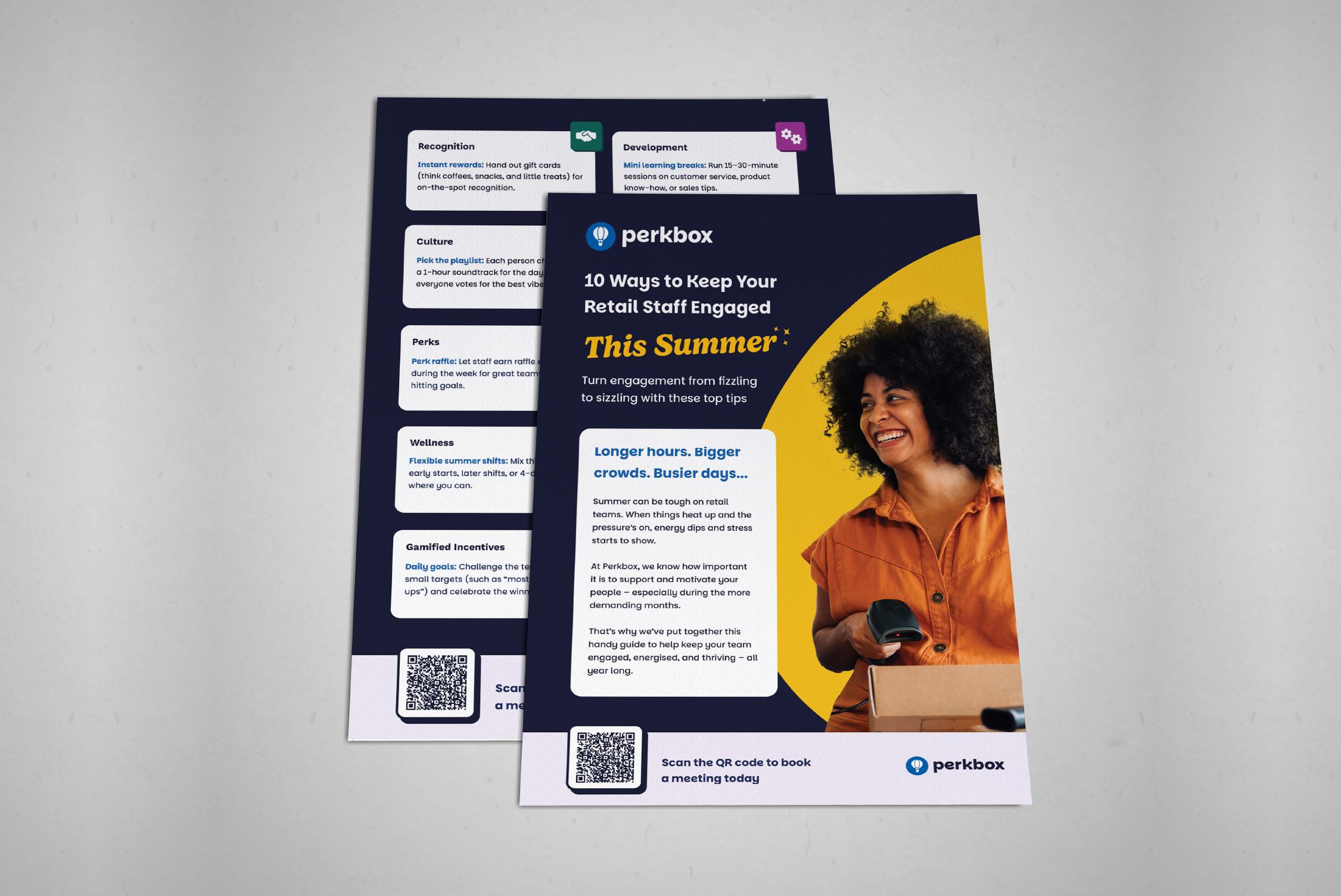
When approaching this flyer design for Perkbox, I focused on aligning the visual style closely with the updated brand identity while ensuring the layout remained engaging and easy to navigate. The bold colour palette and curved graphic shapes help reinforce the modern Perkbox branding while creating a strong visual contrast that draws attention to key areas of the page.
I structured the content using clear sections and card-style blocks, allowing information to be broken down into digestible points so readers can quickly scan the flyer. The large headline and supporting imagery help establish the theme immediately, while the QR code call-to-action provides a clear next step for users.
Overall, the goal was to balance brand consistency with a clean, structured layout that keeps the content visually appealing and easy for readers to engage with.
The Challenges & Result
The main challenge with this flyer was accommodating a high volume of copy within the design. While this initially led to multiple layout explorations, the content was ultimately condensed into clear bullet points and structured content blocks.
This approach made the flyer more engaging and easier to navigate, ensuring the information remained clear while aligning with the newly updated Perkbox branding.
Spotlight of my work
Welcome to the spotlight, where I highlight some of my favorite projects for
your eyes to see and enjoy